Category:

Design

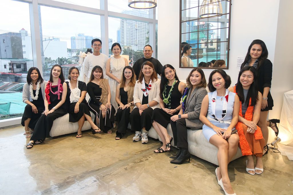
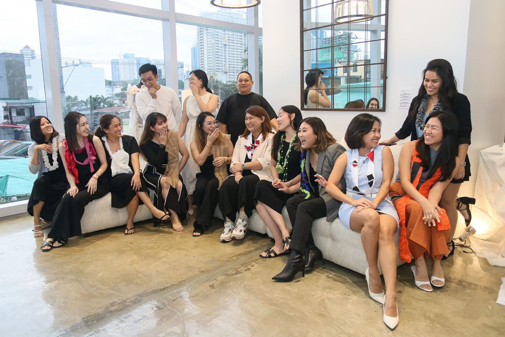
MANILA, PHILIPPINES — SoFa Design Institute, a leading fashion school in the Philippines, has unveiled its newest campus at Proscenium Rockwell. This new space marks a significant chapter in the institution’s history, with the students taking on a more proactive role in the project alongside SoFa staff, from its conception to the building’s final design.

Architect Dana Manimbo, a SoFa faculty member,  revealed that the campus’ design emerged organically from a regular student workshop; the exercise was not initially intended to be a blueprint for the new campus.

“We started by generating concepts and planned to pass them on to the board of directors,” Dana explained. “However, the board encouraged us to develop the ideas further. The philosophy behind the campus became clear: it should be designed by students, for students, with our guidance.”

Architect Kenneth Baltazar, another SoFa faculty member, also shared that the 12 students’ ideas were seamlessly integrated because they listened. He explained, “We try to democratize their opinions by involving them throughout the project’s progress. We established open communication with them, including the leaders and deputy leaders.”

Hinging on deeper narratives

The design process used for this project is called the “SoFa Method,”  which centers on narratives and the essence of being. 

A Campus Designed by Students INS 8

17 years since its inception, SoFa emphasizes the importance of authentic narratives. The school’s design method encourages students to generate original ideas rather than relying solely on visual references like Pinterest.

“Every design project at SoFa is grounded in a personal or meaningful narrative,” Dana explained. “We believe that design is a problem-solving tool with a story to tell.

By tracing SoFa’s roots in fashion, the students and mentors played around with the idea of fabric and eventually arrived at the concept of a blank canvas — a metaphor for every student’s creative journey.

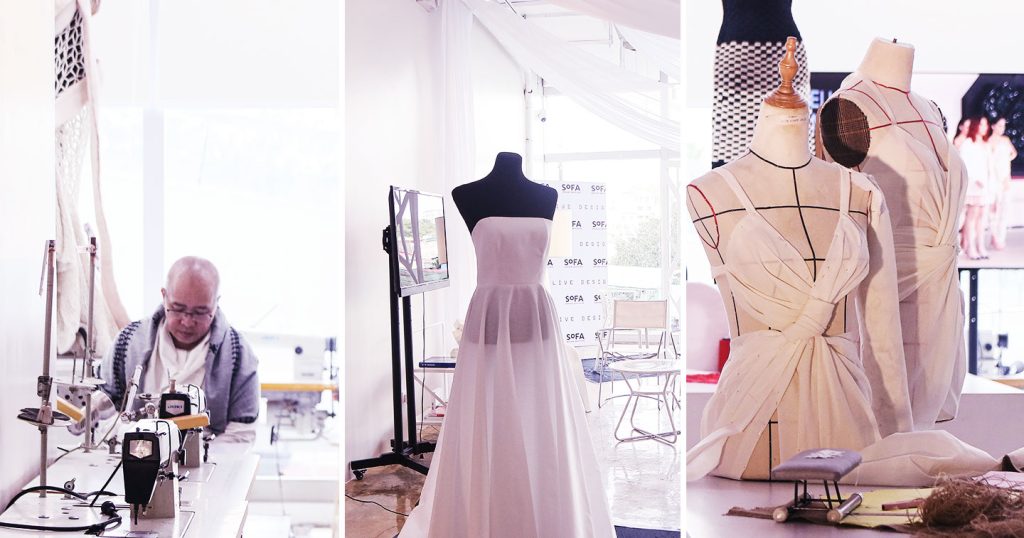
Ivy Bondoc, a student on the project’s conceptual team, explained how they were guided by the SoFa method. “We begin by generating an idea through a mood sculpture. From there, we experiment with forms, shapes, and other elements that capture the essence of the initial concept. Next, we plan the overall design, including floor plans and layout. Finally, we develop detailed drawings and proceed with construction.”

“The SoFa method is essentially a process of introspection,” Kenneth emphasized. “By engaging in self-reflection, we seek to uncover the most fundamental ideas. From these core concepts, we strive to translate abstract thoughts into tangible realities.”

For those who have been doing creative practices, the SoFa method may already be reflected in their work, even if they aren’t consciously aware of it. As Cha Barreto, a student and core team member, explained, “The SoFa method helps us craft a narrative for our designs. This approach prevents us from simply copying and pasting existing designs. Instead, it enables us to create unique designs tailored to the specific client or project.”

“Every design becomes a story, with a distinct background and context,” Cha continued. “It’s not just about selecting a particular color, theme, or style; it’s about developing a highly specialized design that has a compelling narrative.”

SoFa’s adaptable spaces

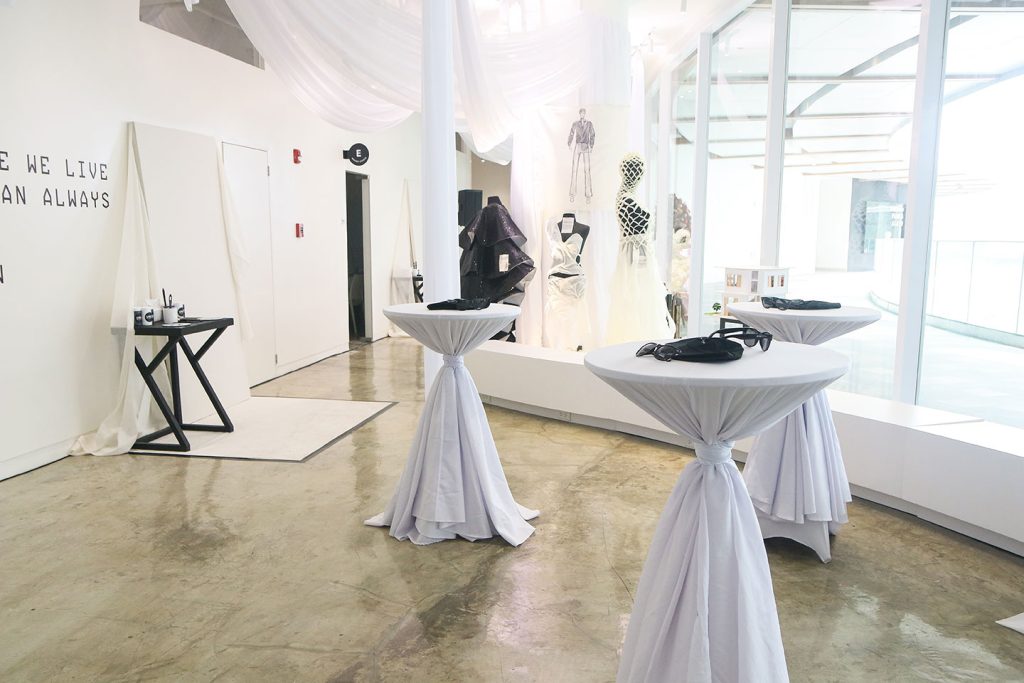
SoFa prides itself on a boutique approach to education, and the new campus reflects this philosophy. The space is designed to adapt to the changing needs of students.

“We visualized the campus as a journey, starting with a sharp turn and gradually curving into a smooth loop, like a runway,” Dana described.

“Classrooms can be transformed into larger workshops or smaller spaces to accommodate various student activities,” she furthered.  “The campus’ elements are highly adaptable, with folding doors that allow classrooms to be combined or separated as needed.”

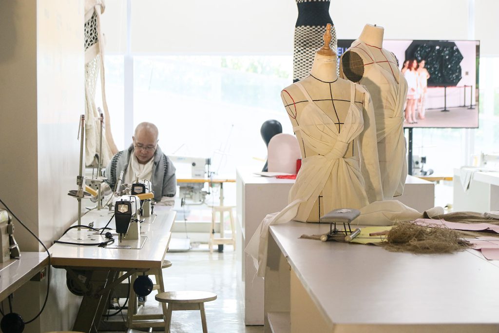
The design studios are dedicated to lectures and classes, while the interior design lab focuses on technical skills like drafting. The fashion lab, equipped with sewing machines and pattern-making tables, is tailored to specific fashion-related activities. 

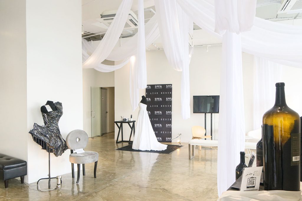
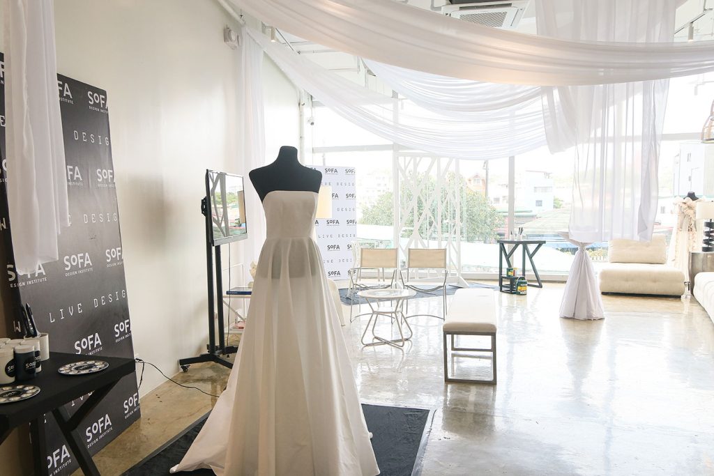
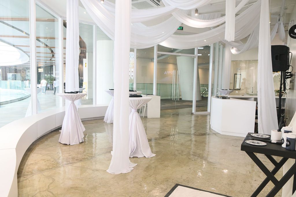
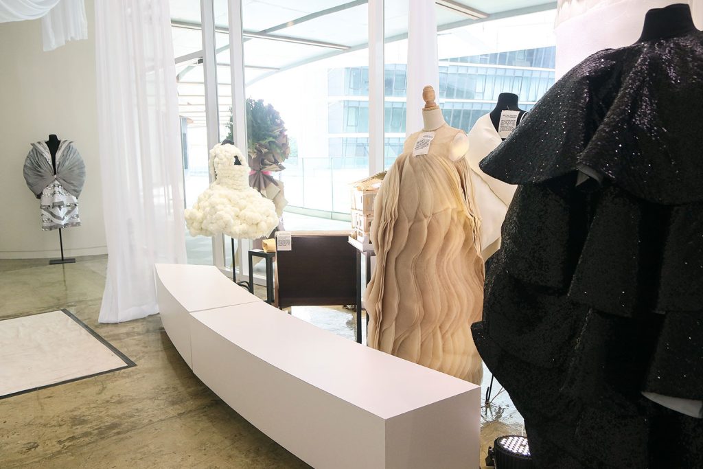
The campus also features a “Collab Space” made for hosting student activities, events, and photoshoots. 

A Campus Designed by Students INS 12 1
Amina Aranaz-Alunan

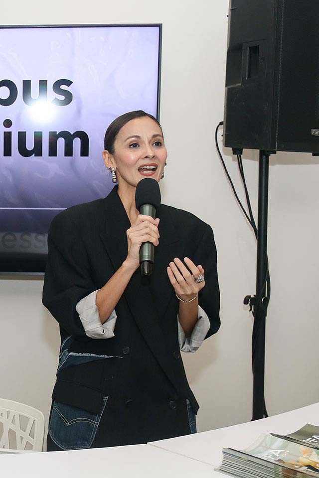
SoFa Co-founder and President, Amina Aranaz-Alunan, envisions the campus as a design hub that extends beyond the student body. 

“We want to open the campus to the community for events, exhibitions, and even photoshoots,” Amina said. “With the upcoming performing arts theater, Proscenium will become a cultural center, and we are excited to be a part of that vibrant environment.”

Amina added  that putting up the campus in Rockwell Center was a strategic move: “Rockwell has a strong history of supporting design and creativity, making it an ideal fit for SoFa.”
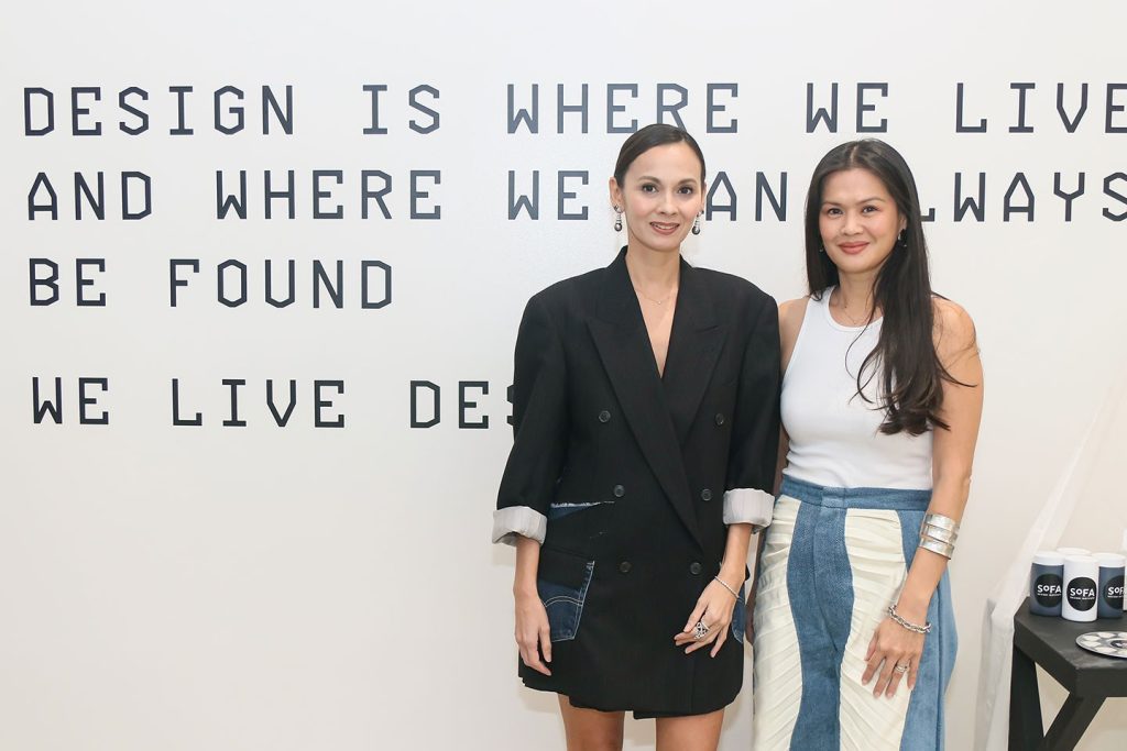
“We live design”

SoFa’s philosophy has profoundly shaped each of the students for this whole experience. Aubrey Madridejos shared, “It’s ingrained in our belief that design is a constant journey of creation, growth, and knowledge sharing,” reflecting the school’s commitment to making design a fundamental part of their lives and careers”’

A Campus Designed by Students INS 13
Loralee Baron-Soong

SoFa Design Institute’s credo, “We Live Design,” encapsulates its mission to elevate the Philippine fashion industry to global standards. As Amina put it, “We wanted to create a space where Filipino designers and creatives could thrive and compete globally. Our goal is to contribute to the nation’s economy and identity through design.”

Ivy shared her vision for the latest campus: “We envision students entering the school and developing into future creatives wherein they can start their creative journeys” 

The need for creative spaces

Creativity is a spark ignited in the minds of individuals and nurtured within communities. 

As former DepEd Secretary Sarah Duterte’s order to remove classroom decorations was highlighted earlier this year, the need to cultivate and protect spaces where creativity can flourish is paramount. 

In contrast, the recognition of historical buildings like the 96-year-old First United Building at the recent Good Design Award Philippines as a vibrant hub for creative communities underscores the enduring value of preserving such spaces.

A Campus Designed by Students INS 10

SoFa Design Institute’s new campus demonstrates that creative spaces are essential for nurturing talent, fostering innovation, and driving economic growth. These spaces are a guide, calling for a society that prioritizes creativity and imagination, where individuals are empowered to express themselves freely and contribute meaningfully to the world around them.

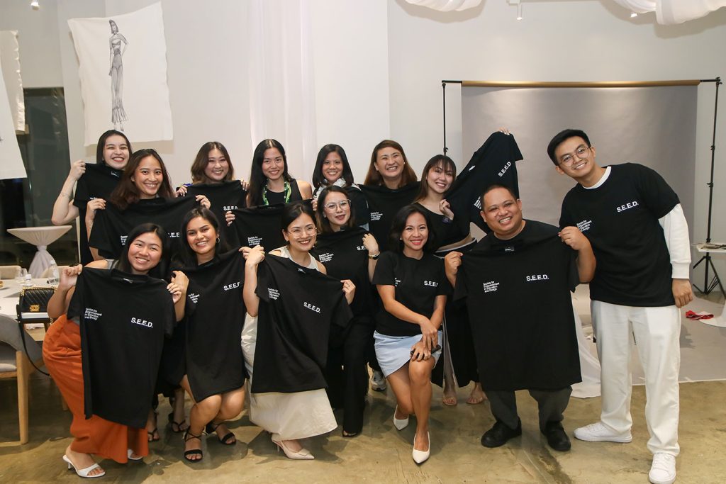
SoFa Design Institute would like to extend their gratitude to the dedicated students who contributed to the design and development of the campus: Bernadette Raralio, Aubrey Madridejos, Pax Carpio, Ivy Bondoc, Toni Constantino, Aki Anicoche, Ritz Beltran, Cindy Choi, Carmel Azimi, Charms Mercado, Cha Barretto, Krice Samson, and Mica Ferrer of SEED (Society for Empowerment in Education and Design).

TOKYO, JAPAN — One of the biggest campaigns to come out of the Asia Pacific region this awards season is “My Japan Railway” by Dentsu Inc. With multiple Grande trophies across the biggest shows in advertising, the design and branding campaign has emerged as one of, if not the, work that everyone knows — a visual piece that is not only eye-catching, but also effective in rallying an audience behind a 150-year old brand. 

Following a remarkable run from Cannes Lions 2023 to D&AD 2024, we go back to an exclusive interview with Dentsu Inc. Executive Creative Director Yoshihiro Yagi and Copywriter Mariko Fukuoka, who the adobo Magazine team caught up with in the midst of their successful ADFEST 2024 season. Unbeknownst to both the adobo and Dentsu teams, the conversation preluded months of more back-to-back wins for the campaign, further cementing its victory lap.

In our conversation with Yoshi and Mariko, the duo delved deeper into the brief from Japan Railway Group, working with six clients, and the personal experiences that fueled this incredibly complex and intensive undertaking.

The brief: Celebrating 150 years of tradition

Dentsu Inc. has had a long client-agency relationship with East Japan Railway and Central Japan Railway prior to this campaign. But to fully celebrate their milestone, the agency had to extend its services to the whole JR Group, comprising of six individual companies. The brief was simple enough: create a logo for the Japan Railway Group’s 150th anniversary. The objective that the agency sought out was two-fold, as its award-winning case study presented: First, “maximize interest in domestic travel that had grown during the pandemic and encourage people to visit Japan’s scenic attractions;” and second, “to inject an element of fun into rail travel and engage people in an interactive activity that enabled them to create their own ‘My Japan Railway.’”

CamSpo My Japan Railway Exclusive Interview 2024 INSERT 1

“But of course, we didn’t stop,” Mariko started. “We delved deeper on why the railways exist. Over the past 150 years, the Japanese railway has developed, and we wanted to connect people and railway once again. So we wanted to find ways to [present] the railway in a more personal context, because this is an ‘emotional infrastructure.’”

As Yoshi put it, “The role of design is to generate a good question, and come up with better answers. In order to do so, we need to understand the habits of humans.” 

What came out of it was an incredibly detailed project that replicated a scavenger hunt, playing into Japan’s love for stamps and its historic significance in Japanese culture. The team turned stamp collection into a digital adventure with virtual stamps designed to showcase the Group’s six colors and reflect the country’s traditional woodblock style. This effectively brought to life the long history of travel scrapbooking in the country, while making it all the more personal through smart phones. 

“The train station and railway are just [physical] infrastructure for most people, but we wanted to make it more personal with the smart phone — the most personal thing for people today. Users can personalize their stamps by adjusting the ‘stamping force’ [and changing the opacity of the stamp] depending on how long they scan the code. We can also see the time they visited the station, and how many other people have collected the stamp. This creates a feeling of shared experiences with other travellers,” Mariko explained. 

The brief was given in November 2022 and launched in March 2023, with 900 digital stamps currently out and more on the way — extending the one-year project to a three-year contract with more assets moving forward. “I think I will be an old man before [we] complete all 6,000 train stations,” Yoshi joked. 

“We made 300 stamps in three months, and after that we added more,” Mariko shared. The process was long and challenging, as Dentsu had to reach an approved consensus among all six companies before finalizing the designs. It’s this dedication to detail and excellence that created such a memorable and effective piece of design and branding work. 

My Japan Railway: An adventure led through connection and emotion

On top of the campaign playing on such an integral part of Japanese culture, it’s the design aspect of “My Japan Railway” that really drew people in, simply because the stamps were so visually appealing in themselves that train-riders naturally wanted to see more and, ultimately, collect more. And with good design and captivating visuals already so ingrained in people’s day-to-day experiences in Japan, the campaign fit right in — seamlessly modernizing an over century-old brand without straying away from tradition and identity. 

Furthermore, what really takes the campaign to the next level is that, while it builds on the functionality of Japanese trains and the cultural relevance of stamp collection, it also zooms in on the so-called “little” details that passengers see everyday, but might take for granted. These are the train workers who make sure everything’s in top shape and that every passenger has an excellent experience; the items necessary to ensure trains are safe and on-time; and the unique cultural elements that characterize each individual station. 

“This is not just about creating a stamp. This is about rebranding Japan. And also I think, each station has a different characteristic that even Japanese people don’t know. So whenever we travel, we don’t know what culture they have. That’s why the train travel became more. Even us who live there, we don’t know the culture or history of [these stations],” Mariko shared.  

To put it simply, “My Japan Railway” is a celebration of all the parts that make a whole; a colorful appreciation of every worker, destination, train ride view, and experience that make up the collective Japan Railway story. A work of “national pride,” as the duo put it.

“To us, rich and luxury is not about premium seats. It’s about experiencing the top itself,” Yoshi noted, underlining that everything about the Japan Railway system contributes to the premium experience it offers. 

Train rides are very visual trips to begin with, with scenic views framed with large windows and passengers having nowhere else to look but the outside. For many tourists, it’s one of the most beautiful ways to take in a new city and country — a mark of a new adventure made possible through railroad tracks and large moving metal cars. 

“One of our account team members is a train geek, and during our meetings someone said that it takes five and a half hours to travel to Hokkaido by train. And I thought it would be much easier to fly than to take the train, because it would just take one hour. But our account member said ‘No way! That’s the best train experience.’ From hearing that, I felt that that was what happiness looks like; it’s not just about the destination,” Mariko recalled. 

“From just function to emotion. We call that ‘emotional infrastructure,’” Yoshi added. 

The power of Design

With “My Japan Railway” recognized as an award-winning Design project, we asked Yoshi what, for him, good design means. Initially, he was stumped, noting that the definition of design is evolving as days pass, and it’s changing for him as well. After a few minutes gathering his thoughts, he shared: “In my perspective, it is often said that art is self-expression, and design is objective art. I feel that the times call for brand art projects so there’s a sense that we are writing or doing the brand’s ads [as art]. Art direction does not only mean expression, but how the brand exists, and [treating] the brand itself as an artist.” 

Moreover, with this specific campaign taking in such a cultural and functional object and turning it into something deeply personal, Yoshi also noted the different stories customers have with the brand, and how it contributes to the overall brand value: “Normally you would think that the brand value is just one value that the brand [dictates]. But I believe that there are many values from each customer. The number of customers equal the value of the brand. There’s a different value for each customer because everyone has a different experience with the brand,” he stressed. 

This is beautifully captured in “My Japan Railway,” with each passenger having a unique stamp per station, and a documentation of exactly when and where they got it — a virtual reminder of their own stories and their own experiences in the train at that precise moment. 

True enough, it’s good design that got people — Japanese and foreigners alike — to engage with the campaign and collect their digital stamps, effectively growing the reach and impact of Japan Railway Group’s 150th anniversary even beyond its original goal of mere celebration. 


The complete breakdown (as of this writing) is as follows: 

Dentsu won multiple awards for “My Japan Railway” including a grand total of 12 Grand Prix trophies from 2023 to 2024 award seasons, and one very rare Black Pencil from D&AD 2024.

Cannes Lions 2023: 

  • Industry Craft — Grand Prix
  • Design: Brand Collateral — Gold
  • Industry Craft: Brand & Communications Design — Gold
  • Direct: Art Direction/Design — Shortlist
  • Design: Digital Installations & Events — Shortlist

London International Awards 2023:

  • Design — Grand Prix
  • Design: Art Direction Campaign — Gold
  • Design: Use of Illustration Campaign — Gold

Spikes 2024:

  • Digital Craft — Grand Prix
  • Direct — Grand Prix 
  • Industry Craft — Grand Prix
  • Brand Experience & Activation — Silver
  • Design — Silver
  • Design — Shortlist

ADFEST 2024:

  • Brand Experience — Grand Prix
  • Design — Grand Prix
  • Digital Craft — Grand Prix
  • Lotus Roots — Grand Prix
  • Design — Gold
  • Direct — Gold
  • Mobile — Gold
  • Print & Outdoor Craft — Gold
  • Media — Shortlist

Clio Awards 2024:

  • Design: Direct Marketing — Grand Prix
  • Design Craft: Illustration — Gold

ADC 2024:

  • Illustration — Best of Illustration
  • Illustration: Book – single — Gold
  • Illustration: Branded identity – series — Gold
  • Brand / Communication Design Branding: Branding Systems / Identities — Gold
  • Brand / Communication: Promotional – Wildcard — Gold
  • Interactive: Digital Craft – Art Direction — Gold

One Show 2024:

  • Design — Best of Design
  • Design: Craft – Art Direction — Gold
  • Design: Promotional – Physical Items — Gold
  • Print & Promotional: Craft – Art Direction — Gold
  • Design: Out of Home – Brand Installations — Silver
  • Experiential & Immersive: Craft – Art Direction — Bronze
  • Interactive & Mobile Craft: Visual Craft – Art Direction — Bronze
  • Direct Marketing: Craft – Art Direction — Merit
  • Out of Home: Experiential & Installations – Experiential & Immersive — Merit

D&AD 2024:

  • Art Direction: Integrated — Black Pencil
  • Illustration: Integrated — Yellow Pencil
  • Art Direction: Direct — Graphite Pencil
  • Branding: Digital — Graphite Pencil
  • Digital Design: Digital Experiences — Wood Pencil
  • Graphic Design: Integrated — Wood Pencil
  • Digital & Social: Physical & Digital — Shortlist
  • Graphic Design: Websites & Apps — Shortlist
  • Typography: Integrated — Shortlist

MANILA, PHILIPPINES — Underneath the streets of BGC, at the center of a vast gallery where dining gives way to dancing as the day ends, hangs a massive tree with silk leaves that play with light, painting the walls with fecund shadows. Celadon drapery runs down the length of enormous arches, bringing a rainy texture to the scene as their own lights — hidden behind recesses at the tops and bottoms of these fixtures — lend an ethereal quality to the fabric. At the base of the central arch, a golden DJ booth is crowned by lush greenery, framed on either side by a homey assemblage of sconces and assorted artwork.

This is quite likely the first thing you’ll notice after heading down the stairs from the dimly lit, art deco-inspired entrance of Uma Nota, a Brazilian-Japanese restaurant and bar concept currently drawing in the cosmopolitan segment of Metro Manila’s dining scene. Beyond delivering just a fusion of cuisines, Uma Nota celebrates the rich history between the two cultures, with Japanese immigrants settling in Brazil over a century ago, giving birth to a community that’s developed its own unique nuances within the greater population.

The Bonifacio Global City location is Uma Nota’s third, following Hong Kong and Paris, and is by far the most conceptual in design. Whereas the preceding locations took inspiration from botecos and samba clubs, respectively, Uma Nota Manila’s look is tailored around the marriage between Brazilian-Japanese culture and Filipino hospitality, evoking the former’s festive spirit while maintaining a sense of comfort and familiarity.

The space was designed by Dubai-based interior design practice The Odd Duck, whose awarding-winning founder Asmaa Said was gracious enough to take adobo Magazine on an exclusive walkthrough of each of Uma Nota’s four main areas.

Uma Nota Design by Asmaa Said of The Odd Duck 2024 Profile Photo
Uma Nota Design by Asmaa Said of The Odd Duck 2024 sketch collage

The central dining gallery, where the aforementioned tree resides, is known as The Living Room, pairing the welcoming spirit its name calls to mind with a sense of nostalgia for old-world dance halls. Wood shutters lining the walls and cheeky pineapple lamps within the chamber’s smaller details elicit a tropical warmth to the design, underscored by several arches along the adjoining walls that soften the space’s lines.

It’s these very details that make the room feel more like a home which, according to Asmaa, was the intent.

“We didn’t want [Uma Nota] to be your typical nightclub where you walk in and everything’s black and dark,” she said. “The furniture and everything else is set up almost like a home, like a residential living space so it doesn’t alienate people when they come.”

At the same time, it was crucial that the design still feel native to the Philippines. As we toured The Living Room, Asmaa excitedly pointed out the paintings on the wall opposite the drapery, a collection curated by artist collective The Empty Scholar.

“They’re all Manila-based artists,” she shared. “It’s really important for us that, when we create something, it has context and it has relevance to the location.”

“Uma Nota can be anywhere, so [our design] needs to make sense to Manila,” she added.

To strengthen the design’s connection to the Philippines, Asmaa and her team made sure that the Filipino identity could also be felt in the space’s materiality, and how these elements were used to give Uma Nota Manila a distinctly Pinoy sense of hospitality.

“We tried to use a lot of the local stones, the natural timber, and rattan texturing so we [could] give [Uma Nota] the kind of nuances that would be relevant to the context of Manila,” she explained. “But above all, it was more of the actual people that we wanted to capture.”

“We came earlier, we did our research, we went to the different venues in the city and we were trying to cater the space to be quite successful for what Manila needs right now. And that’s how the actual concept came through,” she continued.

“We have a very strong identity with Uma Nota as a brand, what they do, what Brazilian Japanese cuisine is about and the identity of the fact that it goes from restaurant to nightclub. But that can work differently if we’re talking in Milan or in Lisbon or in Paris. For that to work here in Manila, we had to create a sense of intimacy and not alienate people by being too pompous or luxurious in the typical sense, and that’s precisely why the Living Room concept works. You still have the height, you still have the wow factor, but it doesn’t feel cold. It doesn’t feel unapproachable.”

Quietly sitting adjacent to the Living Room, the Bar area is built for conversation rather than raucous libation. The space itself feels cozy yet spacious — while it has decidedly less headroom than its neighbor, the movement across the Bar’s marble surfaces, mirrored ceiling, and colorful bottle collection filling its modest area with vibrance. Tables are designed to bring people closer; ice wells are fixed into the centers of each one, bringing an easiness to the evening’s flow. When the lights come to life at night, the Bar’s reflective ceiling has, as Asmaa puts it, an almost-psychedelic quality that adds to the experience.

Uma Nota Design by Asmaa Said of The Odd Duck 2024 bar

Together, the Living Room and the Bar represent the thesis of Uma Nota Manila: a space evocative of the unique energy of Brazilian-Japanese culture, blended with the accommodating warmth of Filipinos. There’s a strong feeling of familiarity in the space, even underneath the enormous organic centerpiece hanging overhead, and when the room is filled with the bustle of people singing and drinking and dining and dancing, there’s no doubt that any Pinoy who’s ever enjoyed a night in with friends would feel right at home.

The restaurant’s two private rooms, however, are a different story. While the more open areas embody the synthesis of three cultures, the more intimate spaces unabashedly represent the two halves of Uma Nota’s heritage.

The Tropicalia room, named after the 1960s Brazilian art movement, harkens back to the decade through its listening room-esque design. Flirtatiously pink walls serve as the backdrop to wooden panels topped by soft waves, while a cream-colored carpet serves as the deliciously tactile anchor to the room’s color story. As with the Living Room, there are barely any straight lines in the space, save for the shelf wall housing a collection of fluidly shaped earthenware vessels and retro vinyls.

“The vinyls that we have here act as an ode to the fact that Tropicalia was a movement that was expressed through music, so we’ve got all the original vinyls that you can play and the guests can explore,” Asmaa shared.

The room is fitted with a sound system separate from the main area, as well as its own DJ booth and cocktail cart, making it an ideal space for private events, she explained. “That’s why the acoustics here are well studied to cater for this separation. We mindfully lined the walls in timber paneling and the floor in carpeting so all the materials are naturally absorbent. The same applies to the velvets and fur found in the loose furniture.”

On the opposite end of Uma Nota is the smaller Meiji room, envisioned as a space for VIPs. Upon entering, two details immediately catch the eye: a stunning 12-seater dining table set with marble in a nearly hypnotic warped checkerboard pattern; and a custom wallpaper that flows over the walls’ and ceiling’s seamless curves, enveloping guests within its meticulously drawn foliage.

The wooden panels from the Tropicalia room are a recurring motif in the Meiji room — perhaps poetically so, as the Brazilian and Japanese cultures began to intertwine during the latter room’s namesake. It was at the end of the Meiji era in 1912 when Japanese immigrants began to build their community in Liberdade, Sao Paulo, a key inspiration for the room’s design.

“In Liberdade, there was a lot of mixing of food, of music, of culture,” Asmaa said. “And that came through quite beautifully to create what Uma Nota is all about: it’s celebrating the music and food within a vibrant cultural setting.”

After the tour, I thanked Asmaa for her time and decided to stay behind at the Living Room. I wanted to try one of Uma Nota’s signature cocktails: the Kyoto Sour. It was delightfully balanced, with a generous amount of sake tempered by T&T vodka and brightened by a tangy blend of grapefruit and lemon. A splash of green tabasco brought an earthy body to the profile along with a nice peppery kick, while a touch of agave syrup rounded everything out to create a multi-layered experience that tasted both of revelry and familiarity; excitement and comfort.

As I sipped my drink, I reviewed the recording of my conversation with Asmaa and stopped at a quote that seemed apt for the moment. She was talking about the tree suspended above where I sat.

“It’s very raw,” she said of the centerpiece of her design. “Very uninhibited. It’s not very manicured greenery. It’s wild. We wanted to capture that sense of wildness within this space but more in a sculptural art form.”

Uma Nota Design by Asmaa Said of The Odd Duck 2024 floating tree

With its roots sprawling downwards, its branches reaching out towards the ceiling, the tree at the center of Uma Nota is the establishment’s wild heart. The manner in which its lines and textures play with their surroundings seems to have a musical quality to it, as though the entire room were dancing with itself, joyous and unfettered.

And yet, there’s also a quiet sophistication to it all. The meticulousness with which this mise en scène was crafted, technically complex yet undeniably comfortable, makes it so that my surroundings both invigorate and ground me.

I brought the cocktail to my lips and drank in the scenery. It felt foreign; it felt like home.

Uma Nota venue photos by Sergei Nekrasov.

Bang Pineda Latest Collection Fashion Show INSERT
Bang Pineda

MANILA, PHILIPPINES — After a hiatus from the fashion scene, esteemed designer Bang Pineda has announced his highly anticipated comeback with a fashion show scheduled for June 05 at Tower One & Exchange Plaza at Ayala Triangle Gardens in Makati. This momentous event will mark Bang’s first runway showcase since his last acclaimed presentation in November 2019.

Following his triumphant past endeavors, Bang unveils his newest creation, a stunning 50-piece collection that promises to captivate audiences and redefine contemporary fashion. With a fusion of streetwear aesthetics and refined elegance, Bang’s latest designs reflect his unparalleled creativity and visionary approach to style.

When asked about the decision to return to the runway after such a significant hiatus, Bang shared, “I think it’s time to return to the runway. My last show was pre-pandemic, in November 2019, and it’s been that long. I always wanted to do a fashion show, but I felt it wasn’t the right time. I couldn’t find inspiration, I wasn’t feeling it until late last year. I was in Paris, and you all know how I love the city. That’s what gave me the inspiration again to create the new collection.”

Describing his current state of mind, he expressed, “My state of Bang is calm, focused, and optimistic.”

Bang’s latest collection’s inspiration draws from his passions and experiences. “My inspiration for the new collection is my current state of mind — my love for tennis, the beach, and, of course, Paris,” he revealed. True to his signature style, Bang’s collection seamlessly blends sport, leisure, and sophistication elements, offering a fresh perspective on contemporary fashion.

Guests can anticipate an unforgettable showcase as Bang presents his latest collection, characterized by innovative designs, meticulous craftsmanship, and a distinct blend of influences. With an array of garments ranging from structured streetwear to effortlessly chic ensembles, Pineda’s runway revival promises to inspire and delight fashion enthusiasts worldwide.

Catch Bang Pineda’s return to the fashion spotlight on June 05 at Tower One & Exchange Plaza at Ayala Triangle Gardens in Makati.

MANILA, PHILIPPINES — While some designers overseas draw inspiration from the cities they reside in, in the Philippines, the design studio Happy Garaje, based in Cebu, proudly embraces its role as the hometown artist of the city.

Founded by husband-and-wife duo Mark and Johanna Deutsch, Happy Garaje took center stage on Day 1 of Graphika Manila 2024 to take attendees on a journey spanning 15 years, along with a community of storytellers, designers, and artists who find constant inspiration in everyday objects, spaces, and experiences.

“One of the most special things about being an artist is that if you experience through ups and downs, you somehow use your art to try and understand what we’re going through,” said Mark.

“It takes a lot of bravery to put yourself out there, but it is important to tell your own story,” he emphasized.

For their part, Mark and Johanna have focused on local work and carving out a space for pocket events — opening their garage as a children’s book library and hosting storytellers’ nights that, to their surprise, gathered people from all walks of life like lawyers, accountants, and programmers.

“We found out that if you build a space wherein you’re not afraid to be ridiculed, you’re not afraid to be laughed at, most of the time, people would be willing to participate.”

From illustrations and art toys, they have been ideating and executing branding and design for packaging and places, including Red Lizard: an open brief for a taco joint that they fleshed into a concept with the full backstory of the greatest, baddest, and most magnificent Luchador of all time.

https://www.facebook.com/happygaraje/photos/a.10150136761815202/10156366789855202/?type=3]

Among other projects they’ve done are the Kalibutan Project which helped artisans and souvenir makers during the pandemic, Duwa Children’s Festival which brought the children’s gaiety to go outdoors fresh off the pandemic, and Cebu Art Book Fair which provided a new medium of storytelling in printed form.

During their talk, Mark introduced the concept of Pangandoy, which is the Cebuano term for yearning in earnest desire. He asked, “If you could dream without the fear of failure, what would your life look like?”

“I think it’s important to share our dreams. We share a lot of our frustrations, the things that we need to do in life, but [the] sharing of dreams is also special because, a lot of times, our dreams are not just about us. It’s also about the people that we love, and the things that we want for our community, the things that we want for the environment and the future.”

From the simple question of what they want to do with their lives, Mark and Johanna have built a creative community that turns the everyday into creatures of whimsy, magic, and kindness. At the core of it all, their stance remains that “The creative spirit is in everyone, and everyone has a story to tell.”

https://www.instagram.com/p/C3gdYufBMio/?img_index=1

MANILA, PHILIPPINES — Graphika Manila 2024, one of Asia’s biggest and most influential conferences of creativity, returned on February 17 to 18 at the SMX Convention Center in Pasay City. 

Boasting a lineup of stellar creatives who showcase their best works at every conference, an unwavering passion and excellence for art, design, and creativity constantly resonate among the audiences.

However, for Ivan and Pauline Despi, the dynamic duo behind motion design and animation company The Acid House, the lessons they imparted were candid and unexpected but certainly nothing short of inspiring.

As the duo mentioned failure and inexperience as vital ingredients to one’s eventual success, all eyes in the room lit up, now more eager to listen to their backstory.

Lesson one: Start before you’re ready

“The first piece of advice we usually give is to start before you’re ready,” Ivan prompted. 

He cited their own experience of pitching to big companies and brands while simultaneously launching their studio all within a month. Despite feeling unprepared for the opportunities they have in store, it did not stop the power couple from not only landing projects with mainstream clients such as Rappler but also beginning a shift towards the craft of motion and video art.

Lesson two: Small things lead to bigger things

After featuring an exhibit that sprouted from a sketch in their notebook, the couple encouraged the audience: “Keep your sketches and mini doodles. You don’t know when you’ll use them for something bigger.” 

Small things can lead to bigger things — this was emphasized by Ivan as he presented some works he created for 36 Days of Type, an online creative challenge prompting artists and designers to create visually stunning type. His participation in this challenge eventually led to his work being featured as splash screens on Adobe Muse in 2018 and Adobe Creative Cloud in 2019.

Additionally, the couple encouraged embracing hobbies and explorations during moments of idleness, as inspiration can strike even in the most unexpected moments.

Lesson three: Keep an ‘Experience Library’

We are built upon the small things we do every day, and the results of our efforts are no more than a byproduct. 

Pauline emphasized the importance of keeping an “experience library,” an archive or compilation of all of the works you’ve done, regardless if it’s a work in progress or a completed project, an accomplished artwork worthy of a slot in your portfolio or a rejected piece destined to retire in your trash bin. She explained that it can still serve a purpose despite how one views one’s work. “Everything is part of your research, and all the things you do will build up to something meaningful.”

Ivan echoed his wife’s statement, adding that all the experiences they gained eventually evolved into convergence points in their creative journey.

Perhaps the highlight of their talk was when they defied the norm of showcasing one’s best works in the conference by premiering a showreel of all their failed, abandoned, or rejected works.

The “fail showreel” certainly inspired audiences to keep their work and document their progress. 

“Execute your plans. If you’re going to fail, fail faster,” Ivan emphasized. “Each failure is just a learning step to your eventual success.” 

Ivan and Pauline Despi concluded their talk with a final and encouraging lesson: “Start something; make things happen. You’re probably not ready, but they better be ready for you.”

adobo Magazine is an official media partner of Graphika Manila 2024.

MANILA, PHILIPPINES — Manila Broadcasting Company relaunched itself as MBC Media Group, debuting its new branding last February 06, 2024, at the Aliw Theater in Pasay City. The change ushers in a new era of media that serves the Filipino audience.

The company’s new logo and visual identity were commissioned to Organic Intelligence Consulting, with the designs showcasing a fresh declaration of future endeavors while at the same time paying homage to the history of MBC Media Group’s foundations.

This bold new look is indeed a jump from the previous logo form, which resembled an outline of a comet with a serif MBC inside. The new icon is more modern, with a sleek sans serif three-line MBC MEDIA GROUP.

Now in its fourth iteration in 89 years, the new logo features ellipses that symbolize sound waves, an homage to radio’s original business. Its growing form also shows MBC’s vision of gaining a wider reach.

The icon’s whole circle is formed by six parts, symbolizing six segments of the business: radio, TV, promotions, talents, events, and digital.

From MBC’s presser: “The brand mark is rendered to show fluidity, mirroring MBS as it evolves and adapts to the present and the future.”

One of the illusions that show fluidity is that the logo’s colors look like it has a gradient blue, but it is actually flat and color-blocked in a way that makes it appear to be gradually going into deeper focus as it goes smaller.

This new look is indeed a more dynamic venture in itself, representing a new era with its design and direction.

MANILA, PHILIPPINES — Canva has just released its “2024 Design Trends Report” that outlines what trends are expected to be big next year based on designs from its 170 million global users – a valuable heads up to designers, marketers and anyone tasked with creating visual content in 2024.

Canva’s 2024 Top 5 Design Trends: 

  1. PixelationThis graphic design trend draws on classic 8-bit video games and computer animations to evoke comfort and nostalgia. Grids, blocky fonts and pixel art fit perfectly with this trend.
  2. Flow and Form: Flow and Form combines geometric and organic shapes. This trend is all about a professional, yet lively vibe via playful blob art, flowing shapes in murals, and youthful brands.
  3. Motion CollageThe motion collage trend takes its cues from zine culture, handmade scrapbooks and photo collages to create intricate, shifting vistas. 
  4. SurrealismInspired by the 20th century art movement, fantasy art, ethereal designs and weird, subconscious connections are at the core of this trend. 
  5. The Bold RebrandThink vivid, fluorescent color schemes and rounded sans serif fonts. Organizations looking for generational change will draw on this trend to channel positivity, fun and optimism.

As companies evolve in highly competitive industries to deliver exceptional user experience and brand perception, being ahead of design trends is quickly becoming a business priority. Staying attuned to these trends allows designers to create products that resonate with their target audience – capturing attention and making a positive first impression.

Latest Updates

Support Our Community

Please donate to support this community. We appreciate all donations!

Stay ahead with adobo Creative Network

Subscribe our newsletter for latest news. Let’s stay updated!
Google Ad Placement

Your amazing title here

Lorem ipsum dolor sit amet, consectetur adipiscing elit. Ut elit tellus, luctus nec ullamcorper mattis, pulvinar dapibus leo.

YOUR DONATION FORM